Close

Aquarius

Aquarius: Visual identity inspired by the fluidity of the ocean

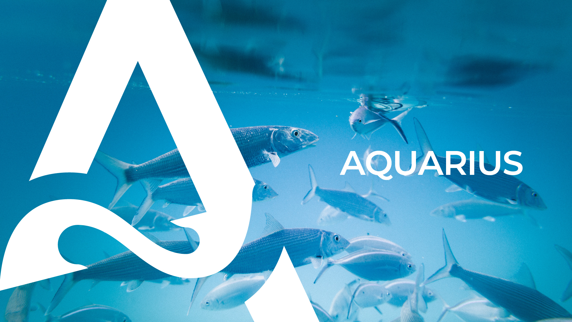
The BUD Agency took on the challenge of creating the visual identity for Aquarius, a fish distributor located in São Paulo, anchoring the project in the values ​​of modernity, freshness and professionalism. The result is a brand that reflects the essence of the ocean and translates the company’s attributes into visual elements that connect with the target audience and the segment.

Branding and Design Project Highlights:

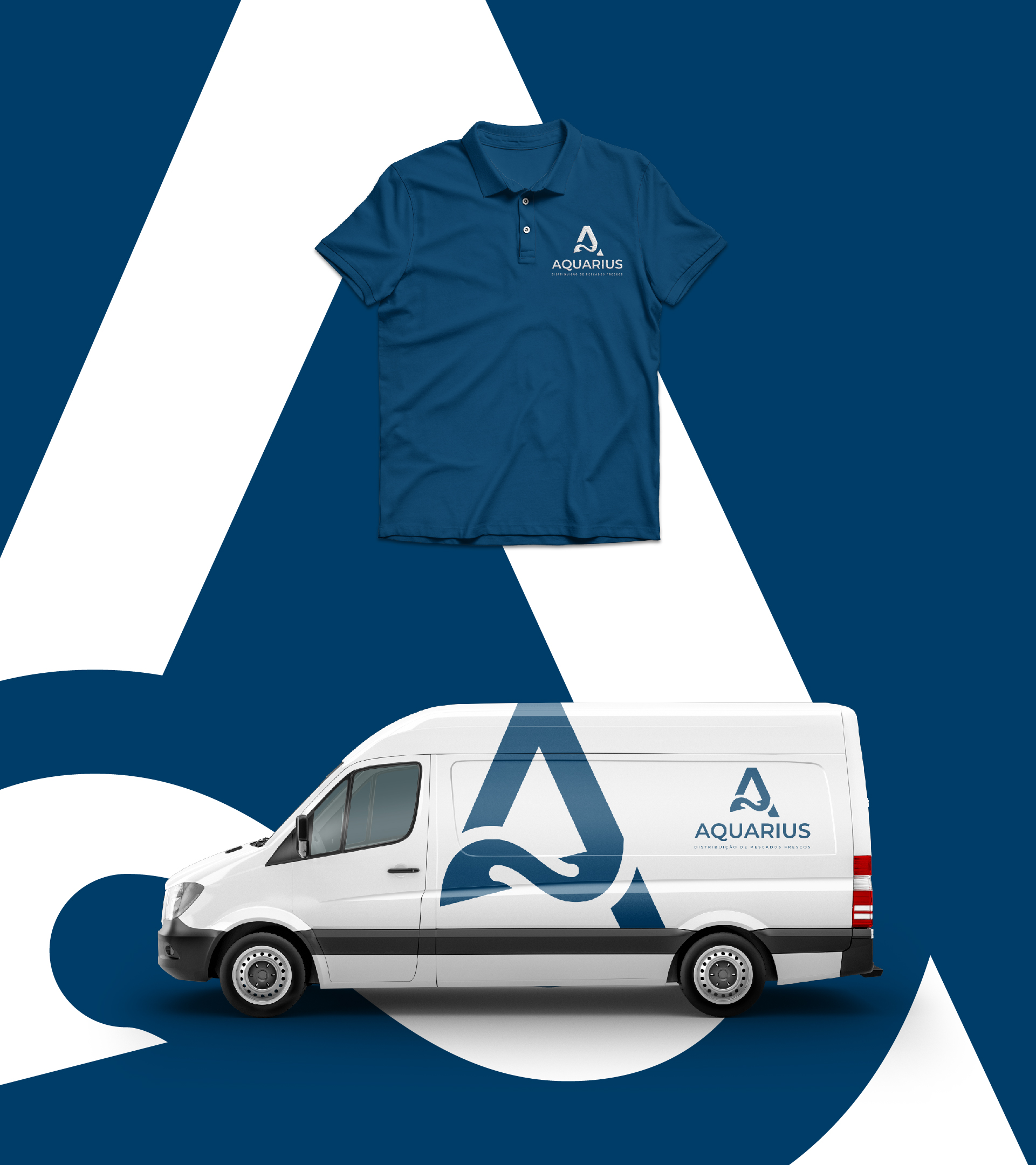
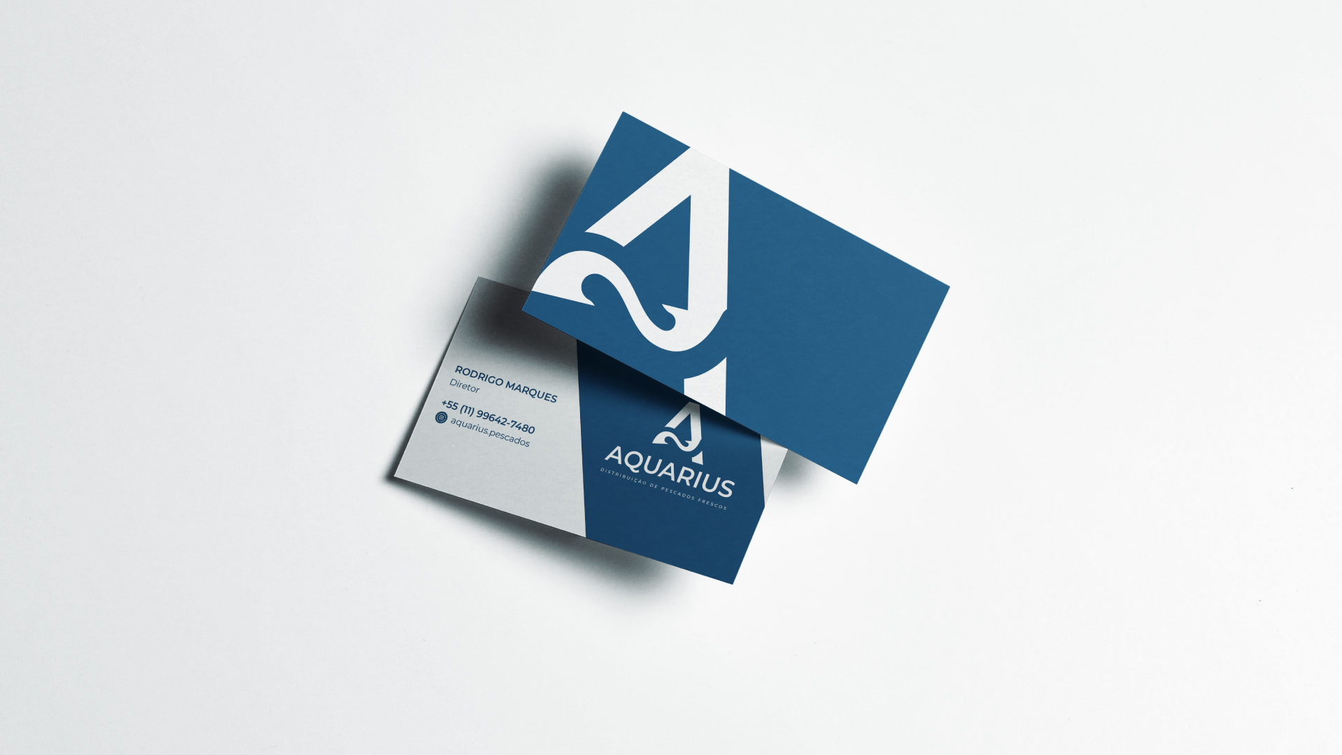
  • Main color: Navy blue was strategically chosen for its strong association with the maritime universe. This tone communicates confidence and stability, while referring to the depth and purity of ocean waters. The consistent application of this palette reinforces the brand’s positioning as a specialist in high-quality fish.
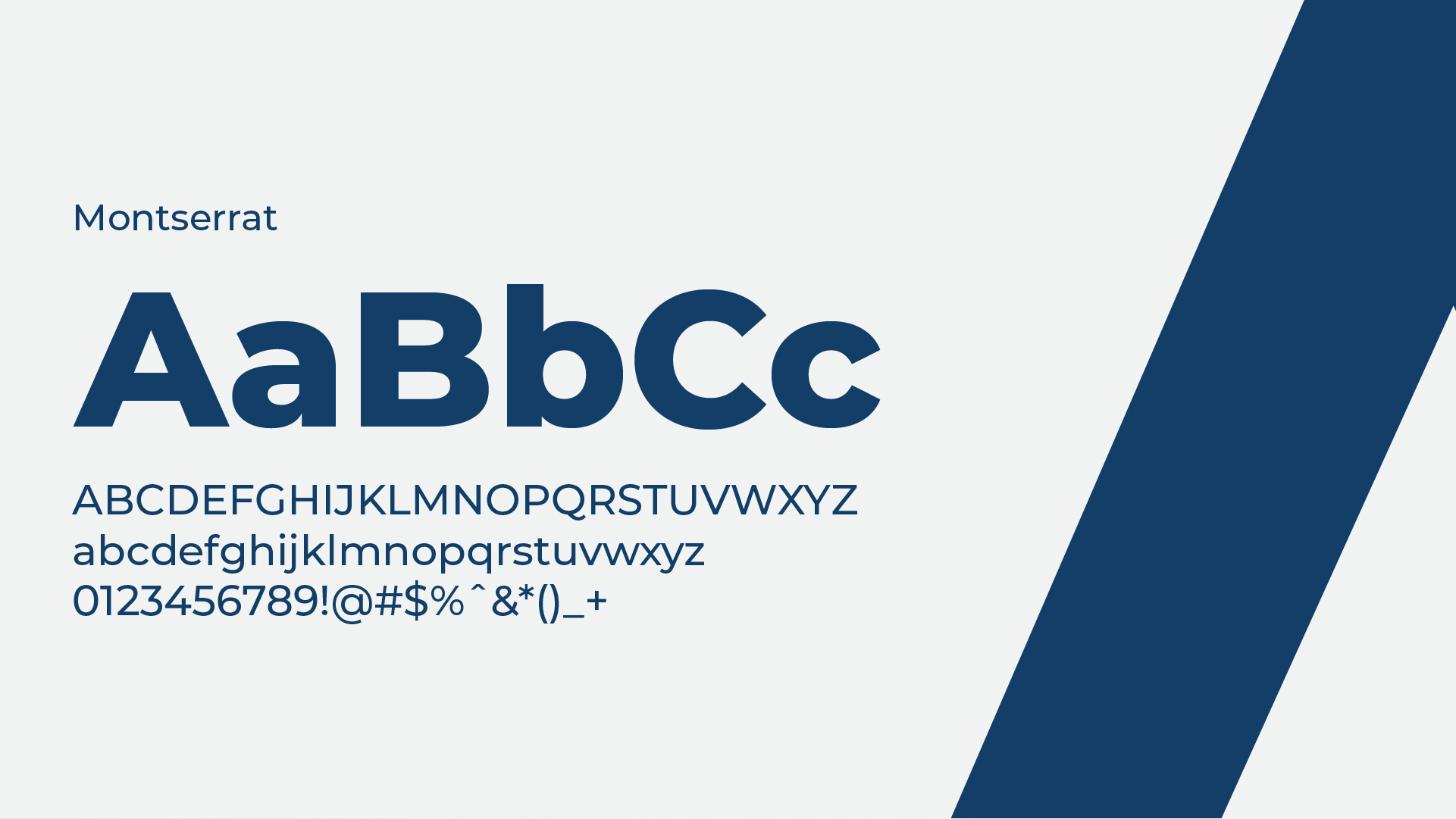
  • Typography: The typographic choice combined elegance and contemporaneity, reinforcing Aquarius’ commitment to the sophistication and premium standard of its products. Legibility and aesthetic harmony were prioritized, ensuring impact in digital and printed materials.
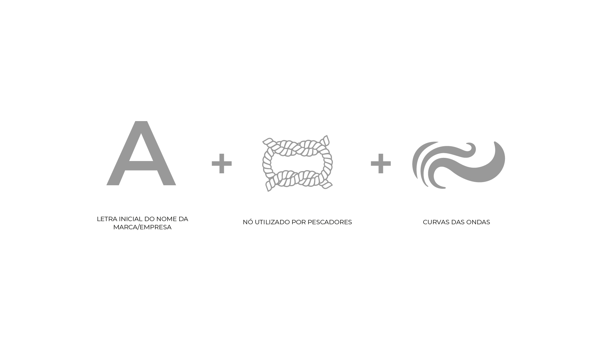
  • Logo: The symbol was developed from fluid and organic shapes, visually conveying the fluidity of the ocean and the diversity of seafood. This iconic element promotes immediate brand recognition, positioning it as a reference in the fish distribution market.

An identity that goes beyond design: More than creating an attractive visual, Aquarius’ identity consolidates its purpose and differentiation in the market. The alignment between tradition and modernity, combined with the coherence in each visual element, reinforces the company’s commitment to quality and consumer experience.

BUD Agency – Transforming brands into memorable experiences.

Aquarius Aquarius Aquarius Aquarius Aquarius Aquarius Aquarius Aquarius
TOPO