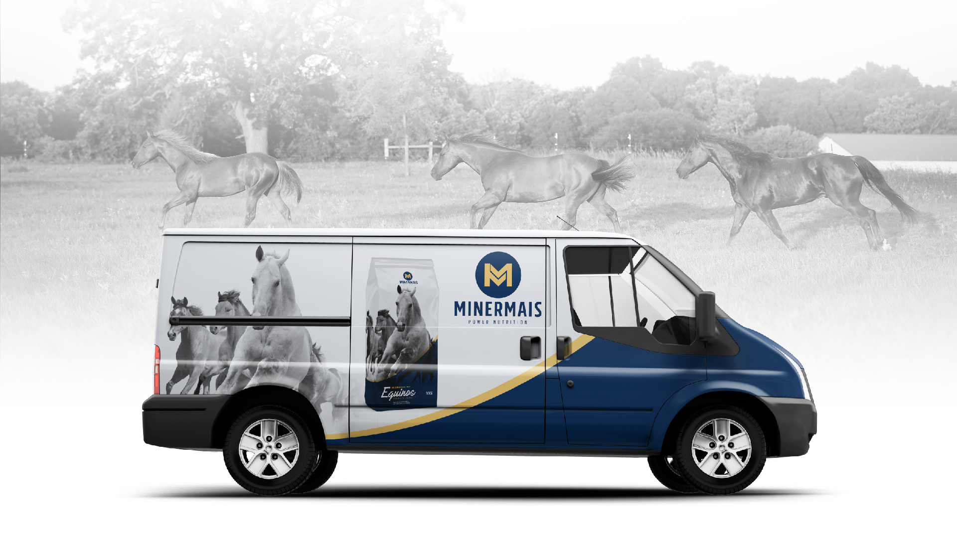


The redesign project of Minermais’s brand and products, was developed based on their tradition and their strong presence in the manufacture of animal feed for the livestock breeding sector. The logo concept represents the strength, protection, also the wide range of products that they offer. The main goal was to update and modernize the branch, though the colors that represent trust, energy and vibration, which aligns perfectly with the quality of products that Minermais offers. Therefore, we created elements that align on Minermais’s context and products, by giving a modern aspect to it, with the goal to make their operation in this sector and expansion moment stronger.


