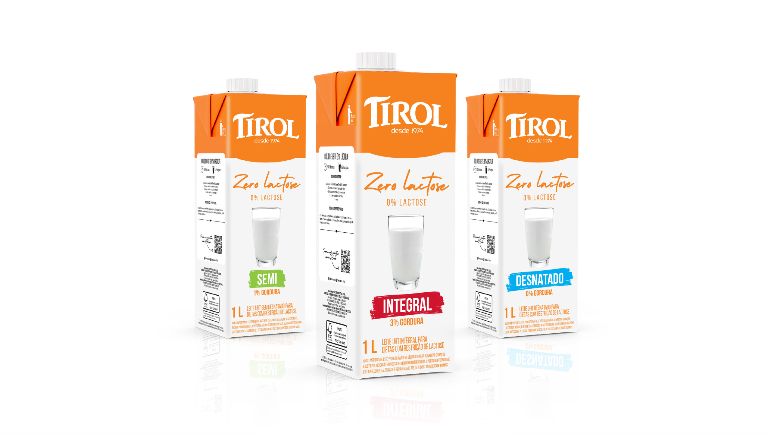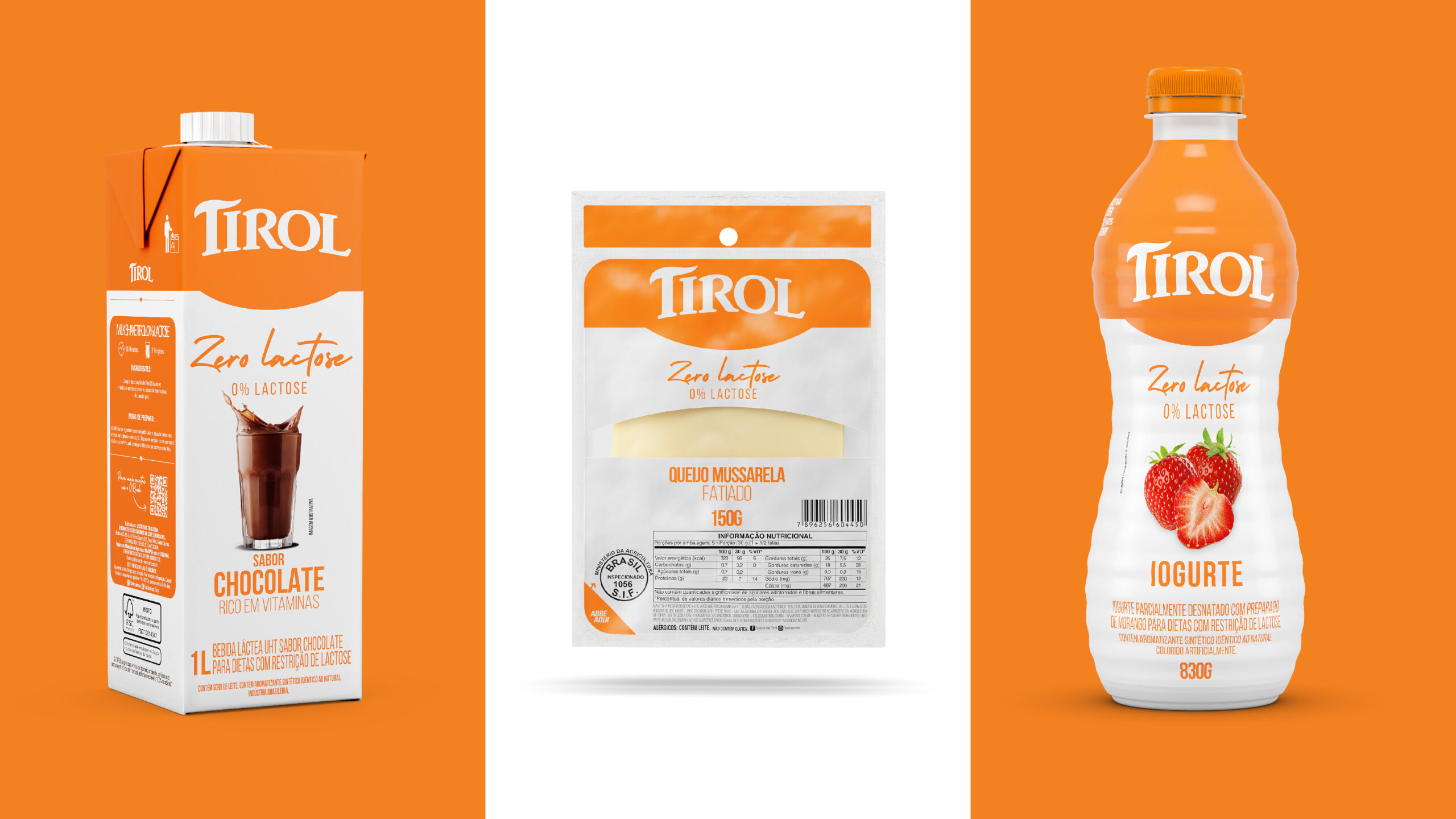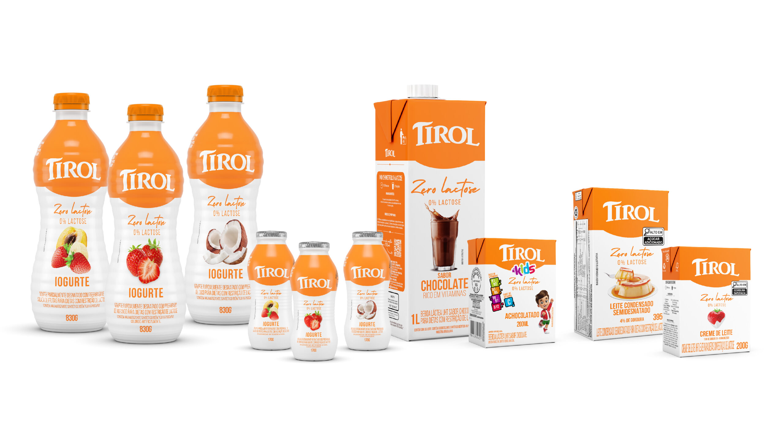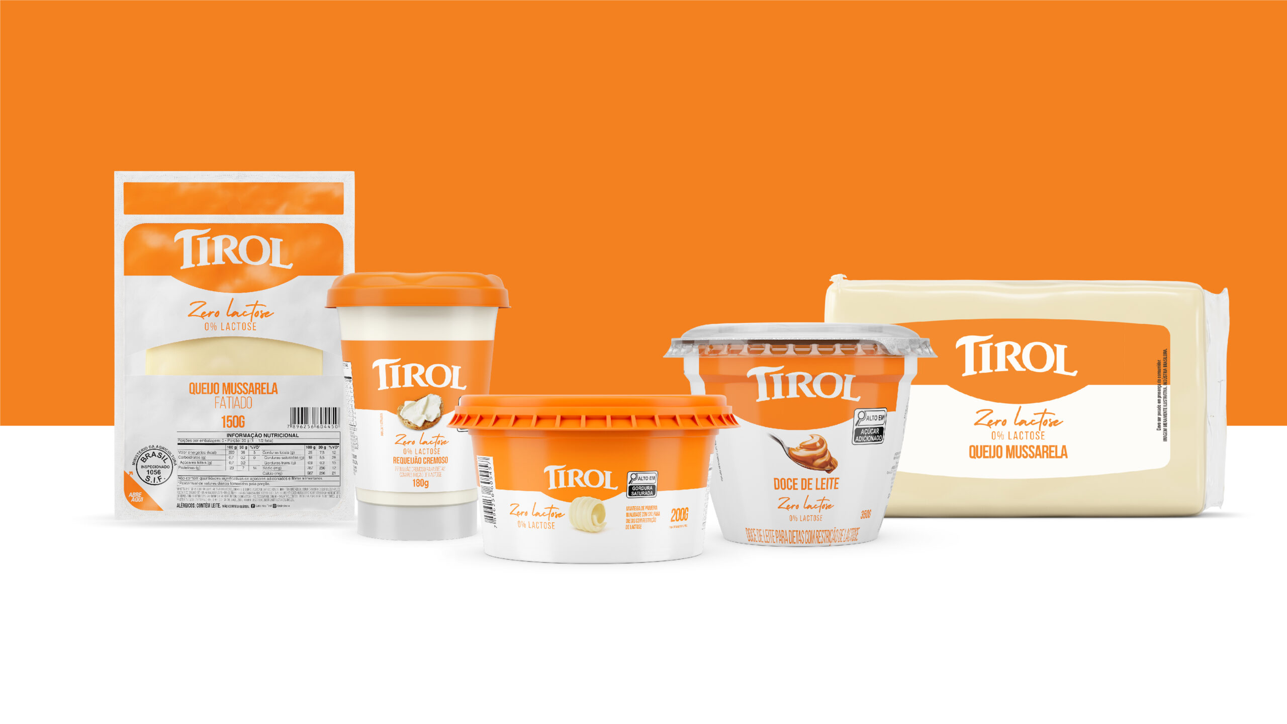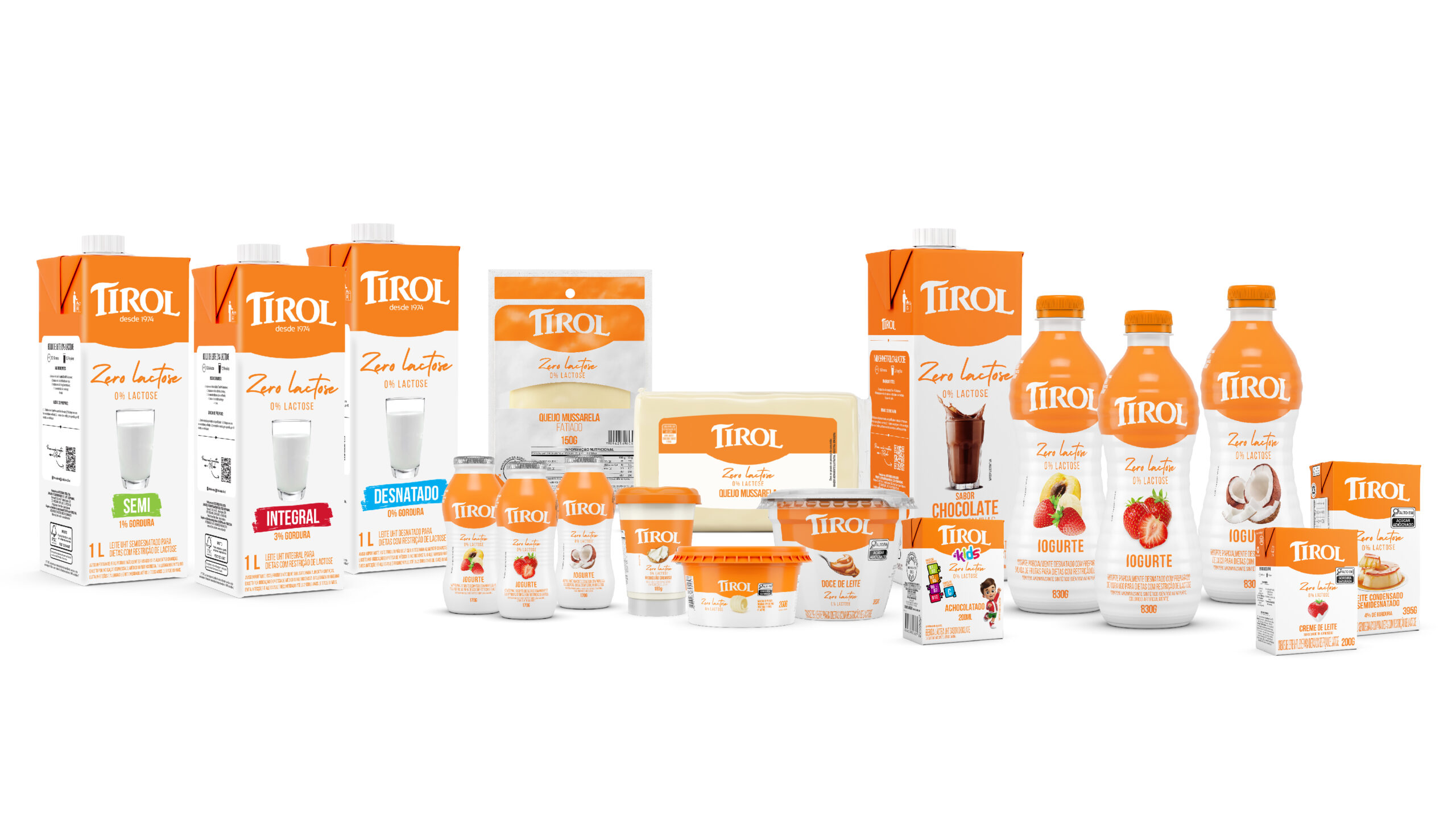


Challenge proposed to recreate the packaging of the zero-lactose line, adding value to the product through cleaner visual communication capable of highlighting the TIROL brand on supermarket shelves.
We created a modern layout to expand the connection with the younger audience. We chose typography to highlight the segment, and applied a curved line just below the brand. In addition to the aesthetic aspect, we used this element to reference the steep valleys of the Tyrol region in Austria, reinforcing the brand’s tradition.
When positioning the product on the shelf, this same line creates continuity, making the brand stand out from other competitors, expanding its spot in the POS.
