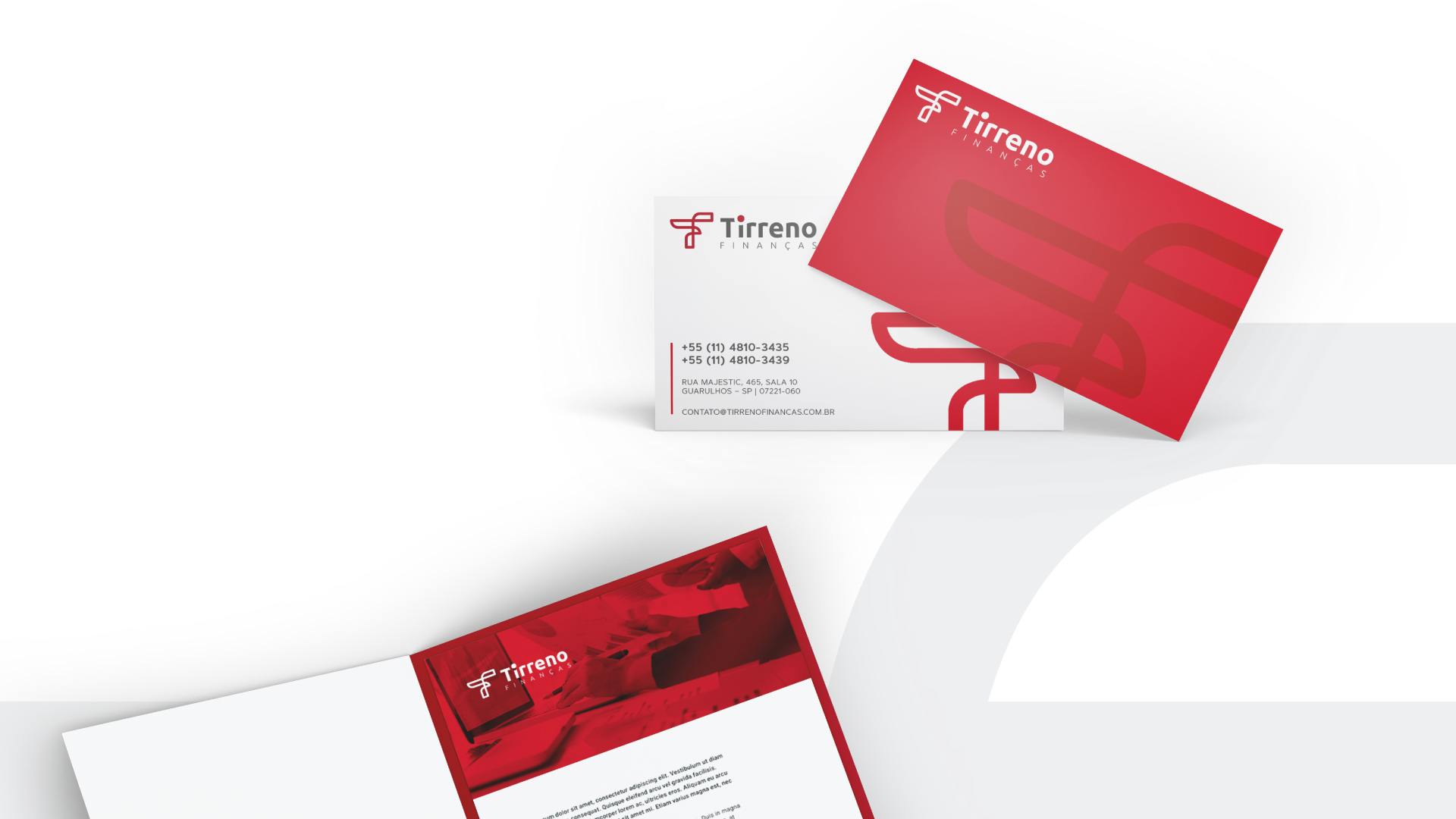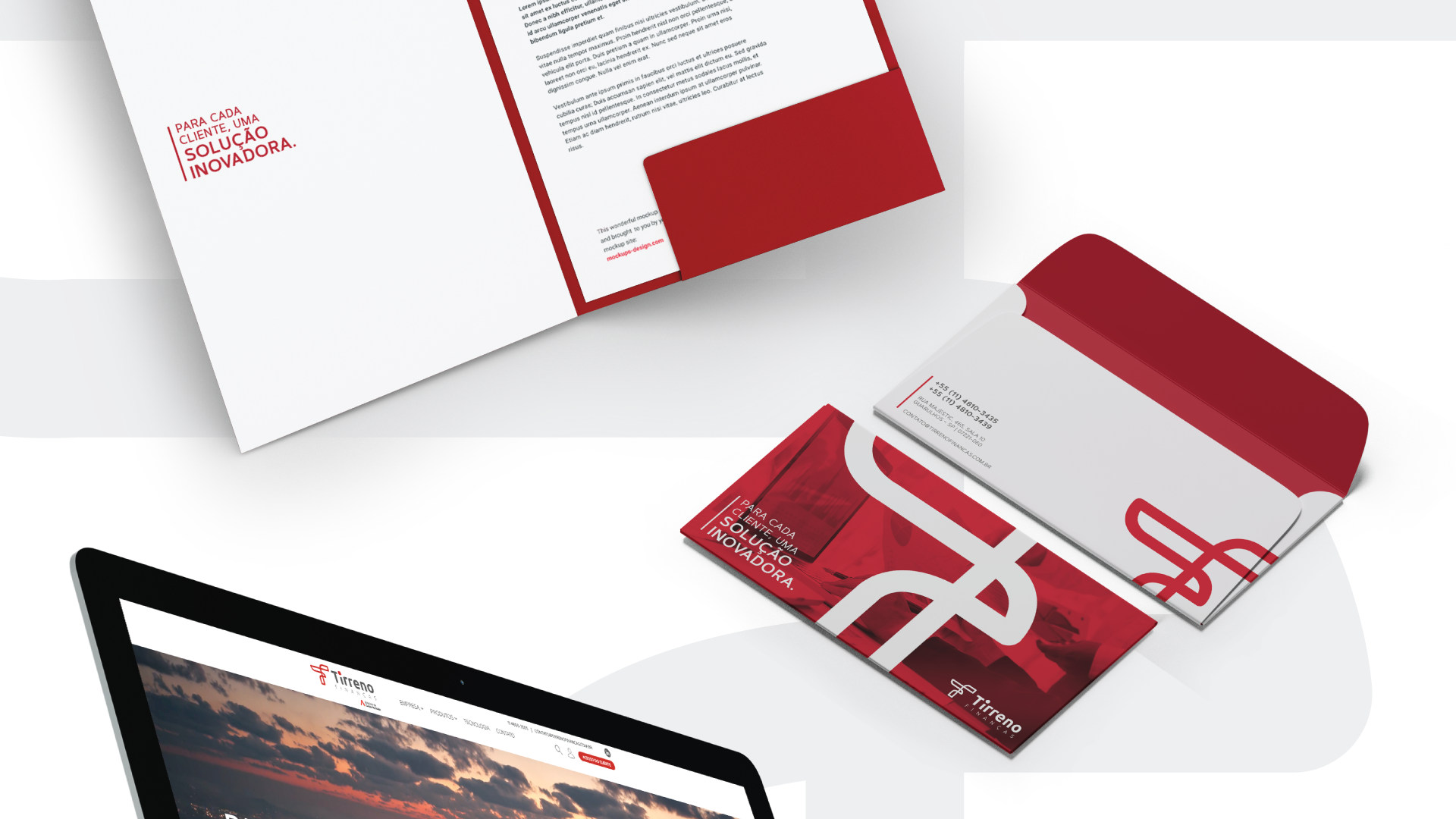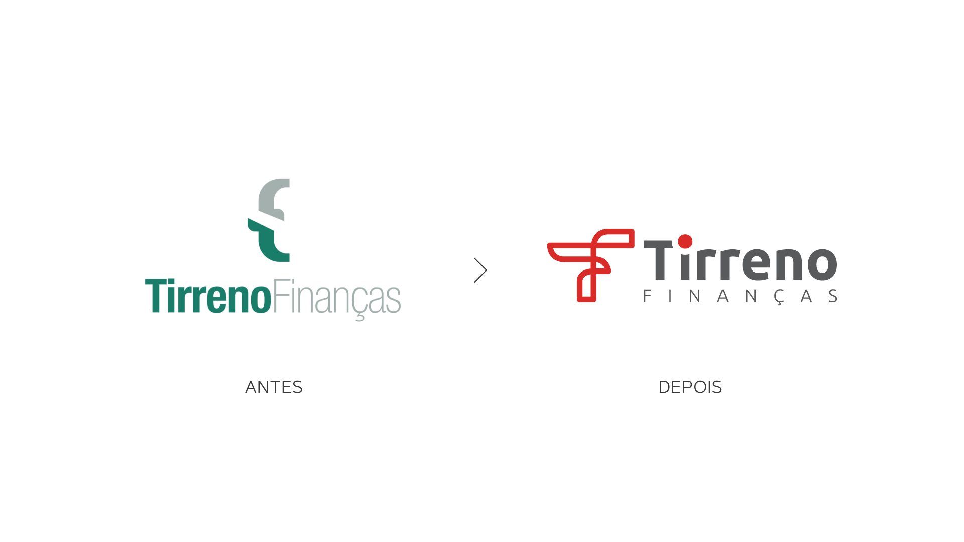


For the Tirreno Finanças redesign project, the proposal was to combine a modern and elegant look with its pillars of excellence, transparency and personalization.
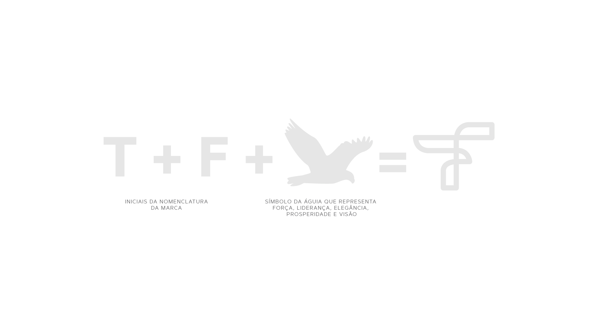
The creation of the identity represents Tirreno’s lasting partnership with its customers, from the junction of the T and F that make up the brand’s nomenclature and form the symbol of the eagle, which symbolizes leadership, strength, and vision of taking each customer to the Innovative solutions.
Along with colors that symbolize professionalism, responsibility and seriousness, as well as representing a connection to the group, which it is a part of.
