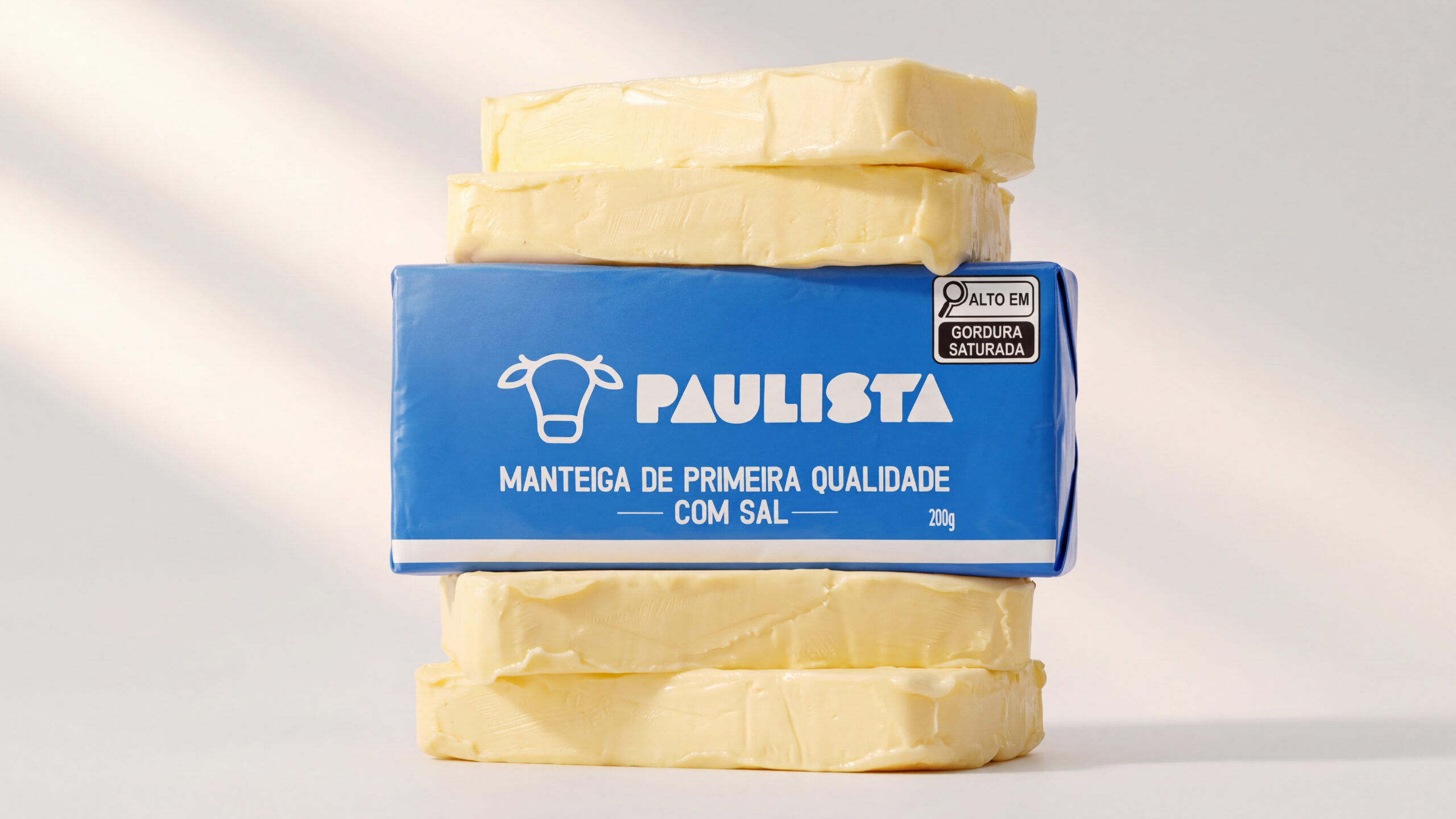
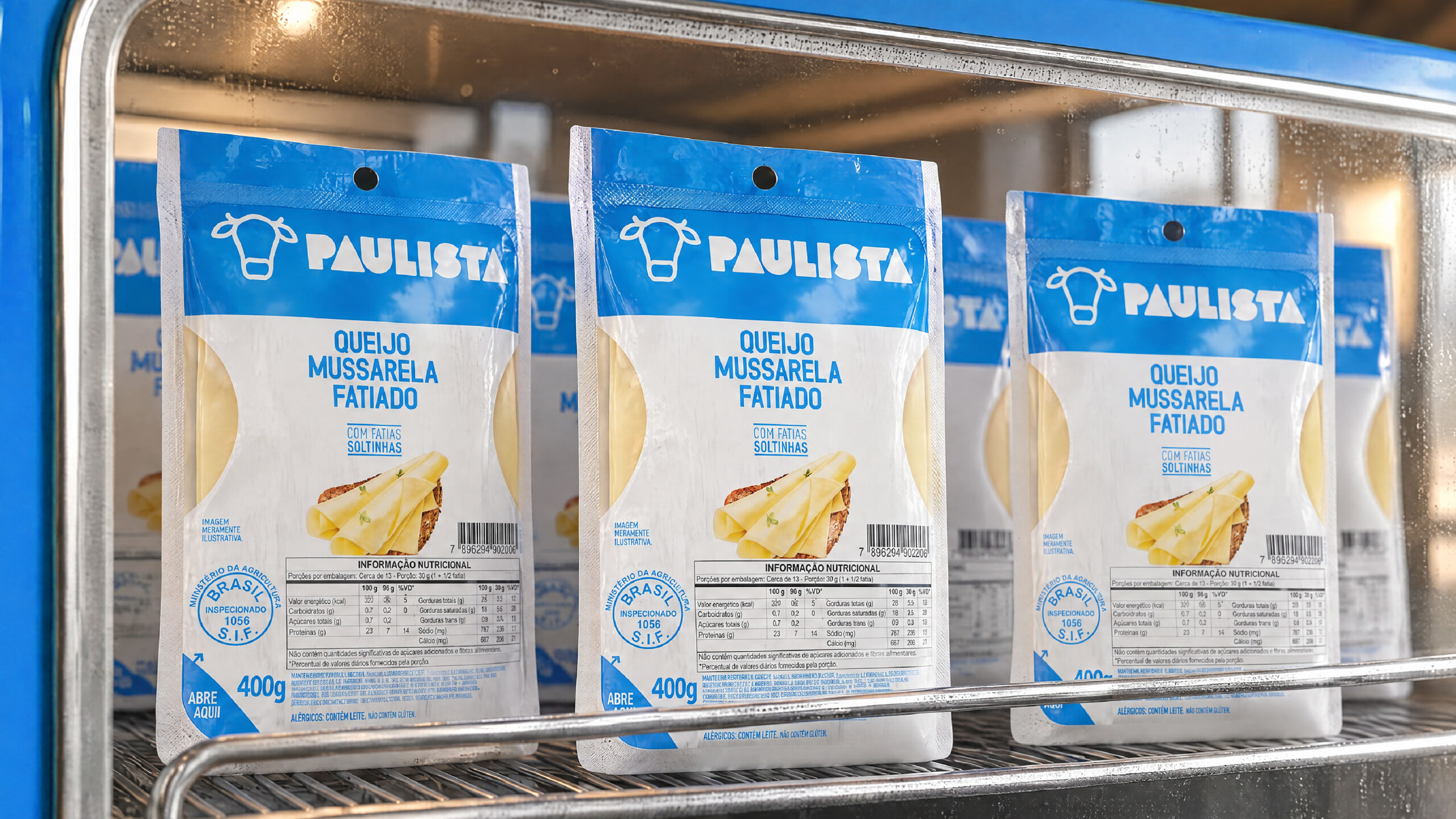
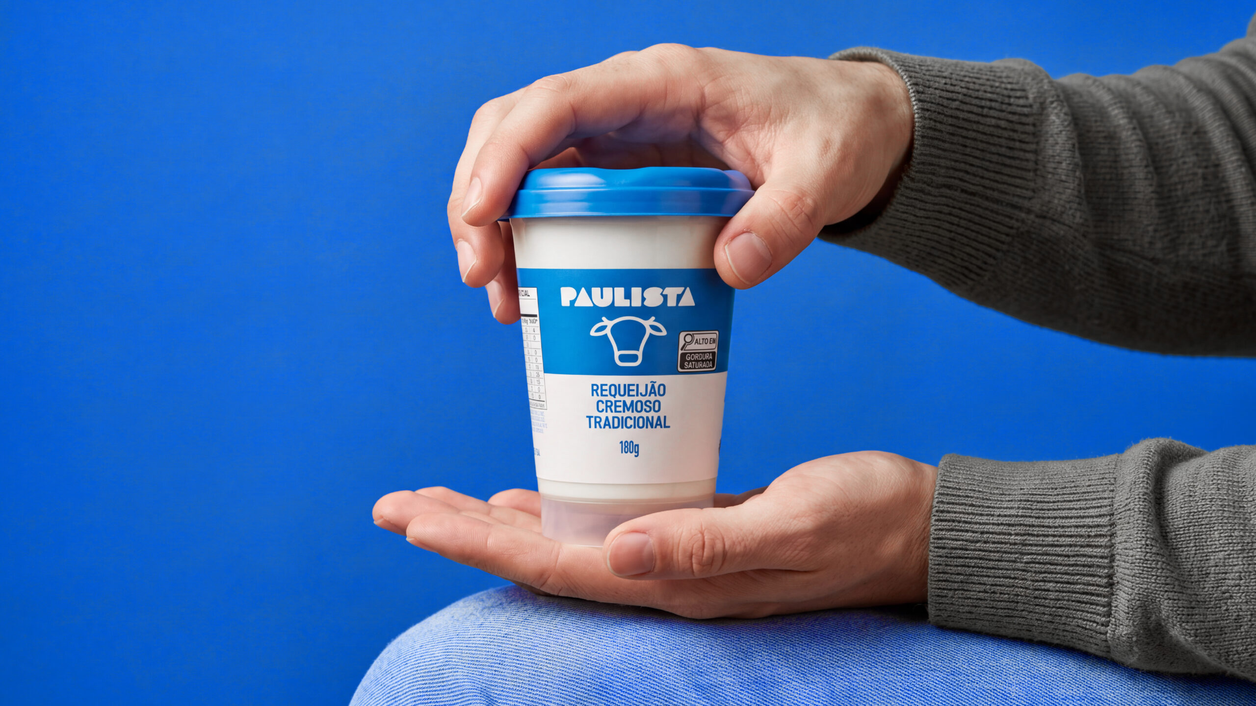
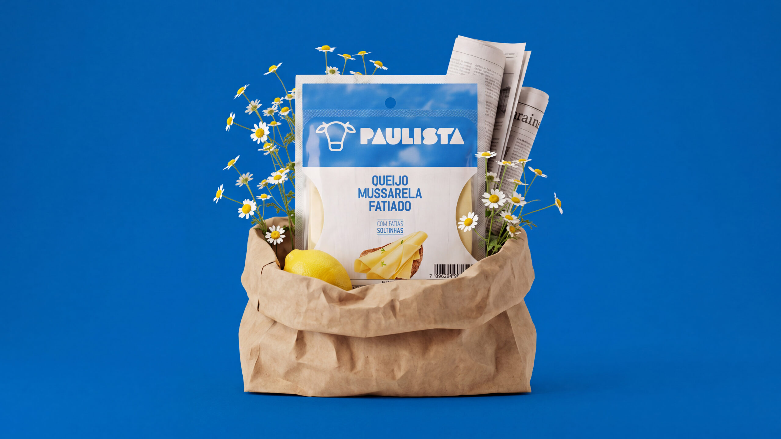
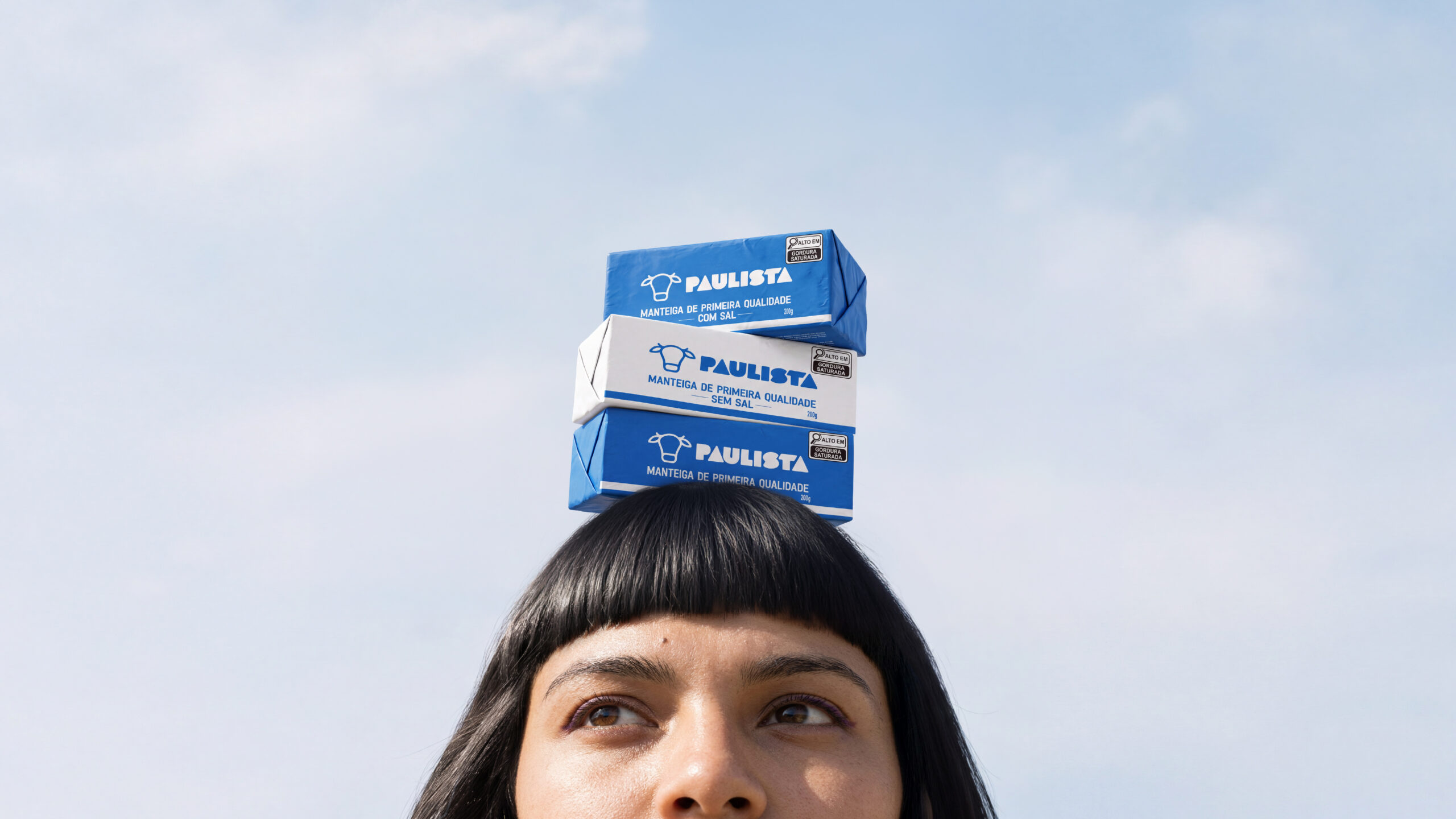
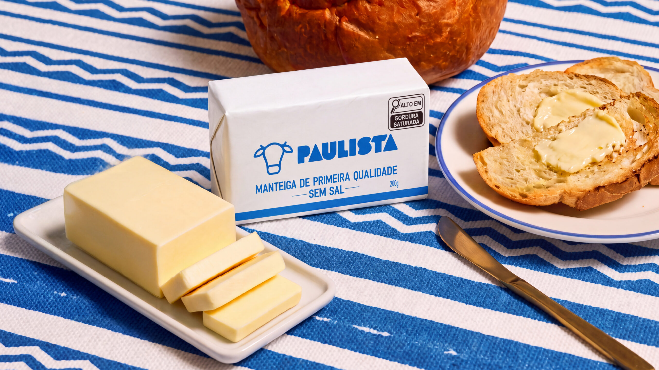
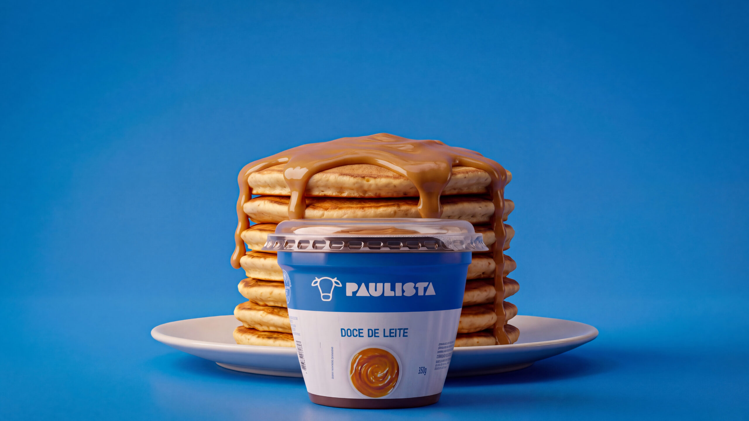
When a brand expands its portfolio, the biggest challenge is growing without losing what makes it recognizable. That was the starting point for our work with Paulista.
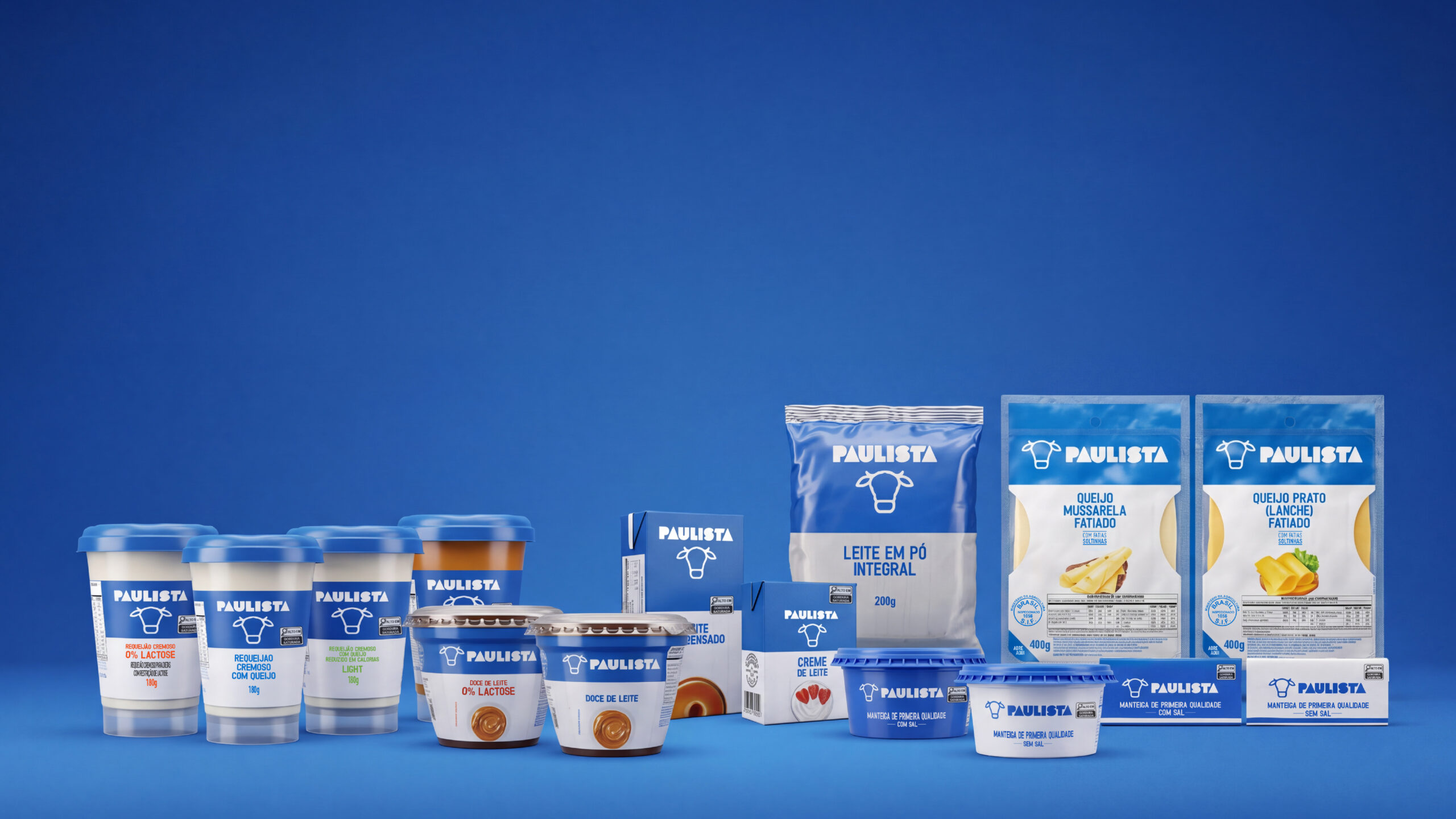
Paulista was expanding its line with new products in packaging formats and types different from the existing ones. Each new format came with its own constraints of space, material and legibility, and the identity had to perform on all of them with the same strength.
We adapted the brand’s visual identity to each new format, building a consistent system of information hierarchy, color, typography and brand application. The result is a packaging family that stands out from a distance on the shelf, while respecting the technical requirements of each format and making it easy to tell products apart.
An expanded line with visual unity, a strong brand block at the point of sale, and a system ready to take on new launches quickly and confidently.
Packaging Design · Line Extension · Visual Identity Adaptation · Packaging System