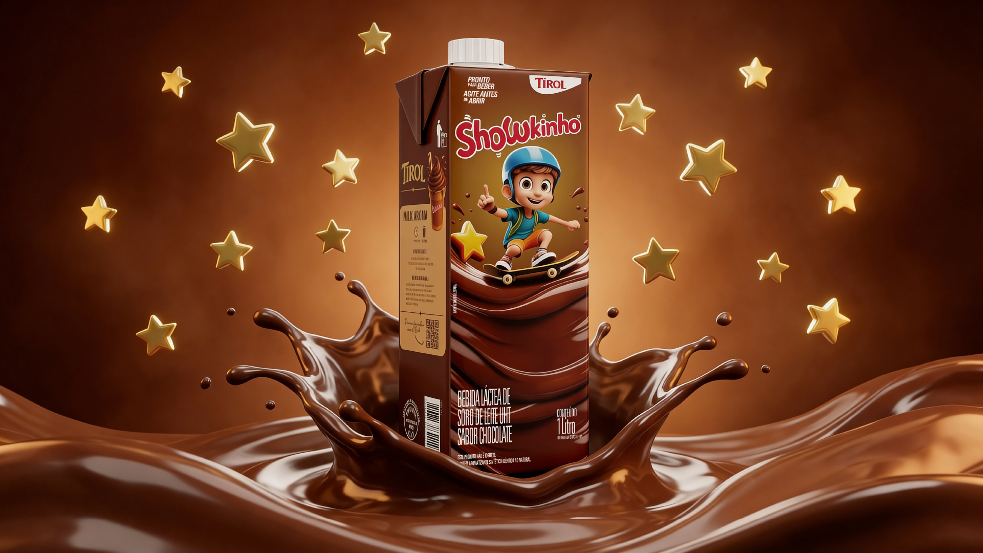
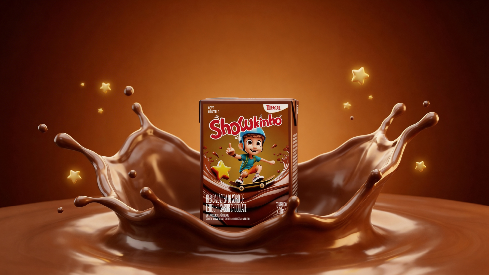
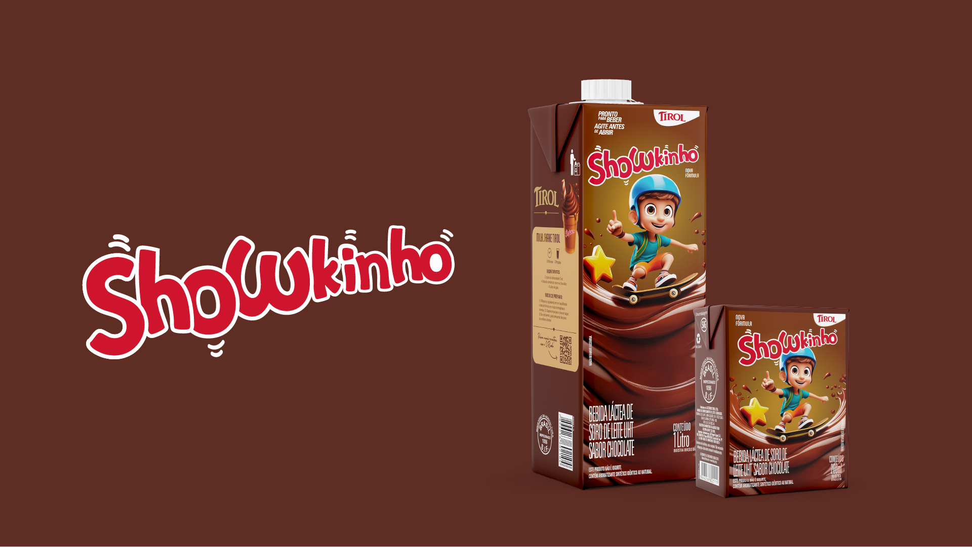
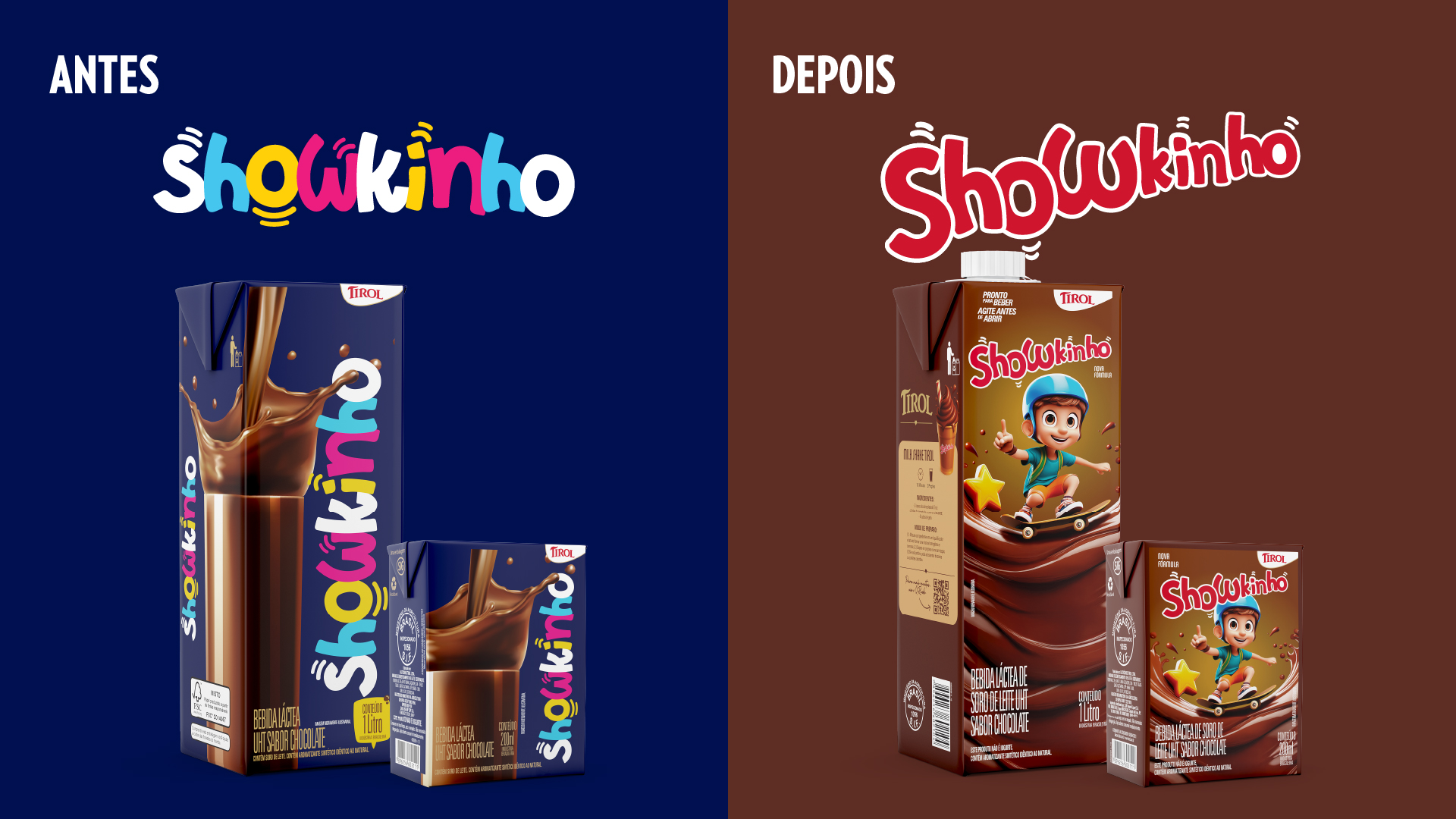
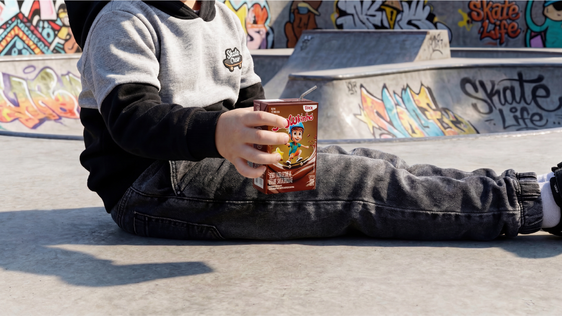
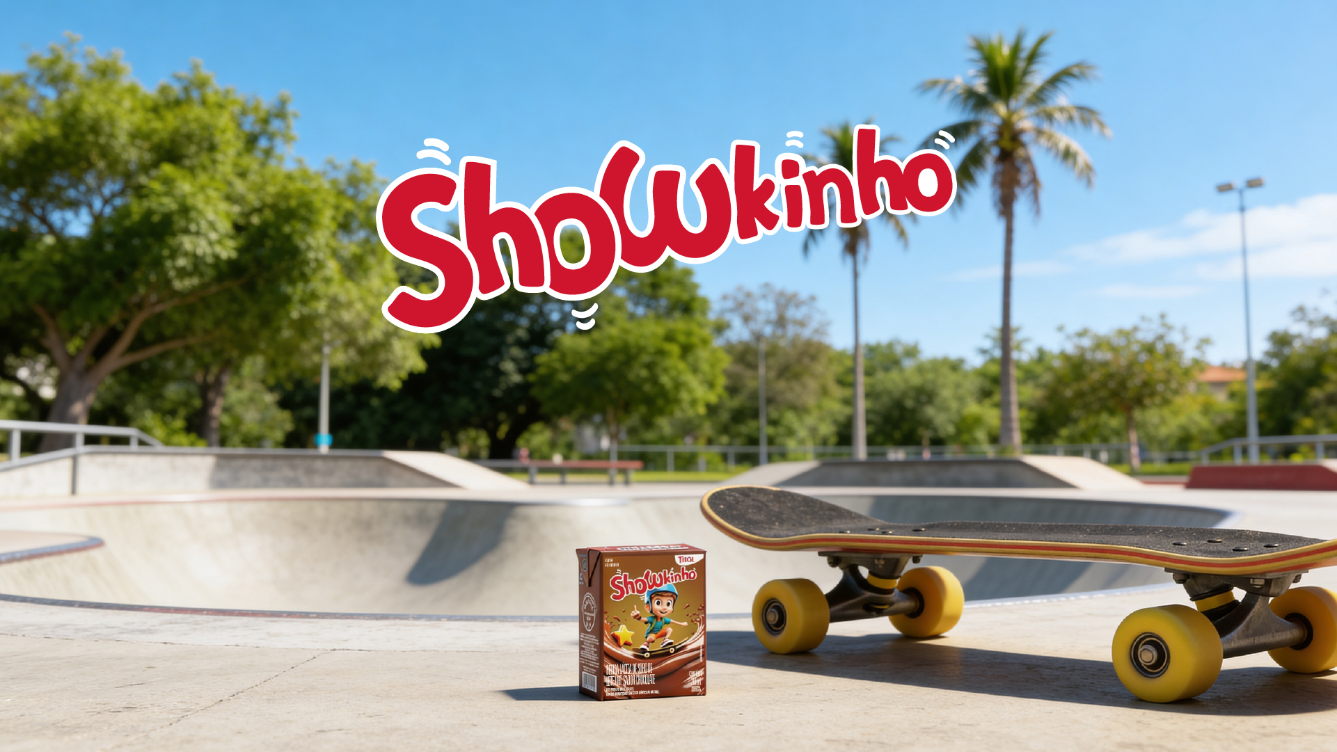
The rebranding project for the Tirol Showkinho line aimed to update the brand and reposition it more competitively in the kids’ category, preserving its recognition and strengthening its presence at the point of sale.
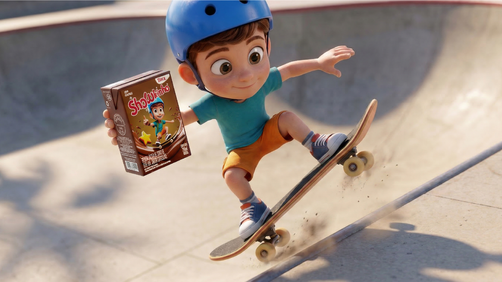
Building on this direction, we developed a new visual language, more dynamic, colorful and engaging, aligned with the behavior and expectations of the kids’ audience. At the heart of the project, we created a character that brings more personality, identification and consistency to the brand’s communication.
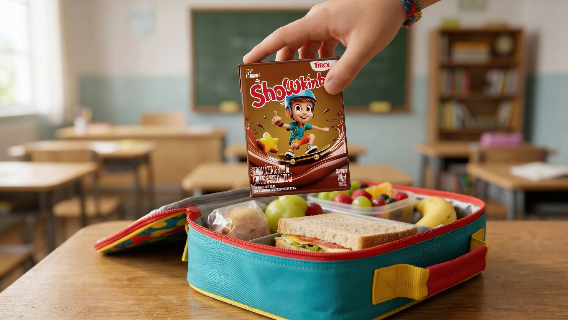
In the packaging redesign, we worked on the information hierarchy to ensure quick, clear reading, highlighting key product attributes and increasing its visibility at the point of sale. The visual construction was designed to balance kid appeal and organization, connecting visual attractiveness with the trust needed for the purchase decision.
The result is a more current, expressive and strategically positioned brand, with greater visual impact and a stronger ability to connect with its audience.